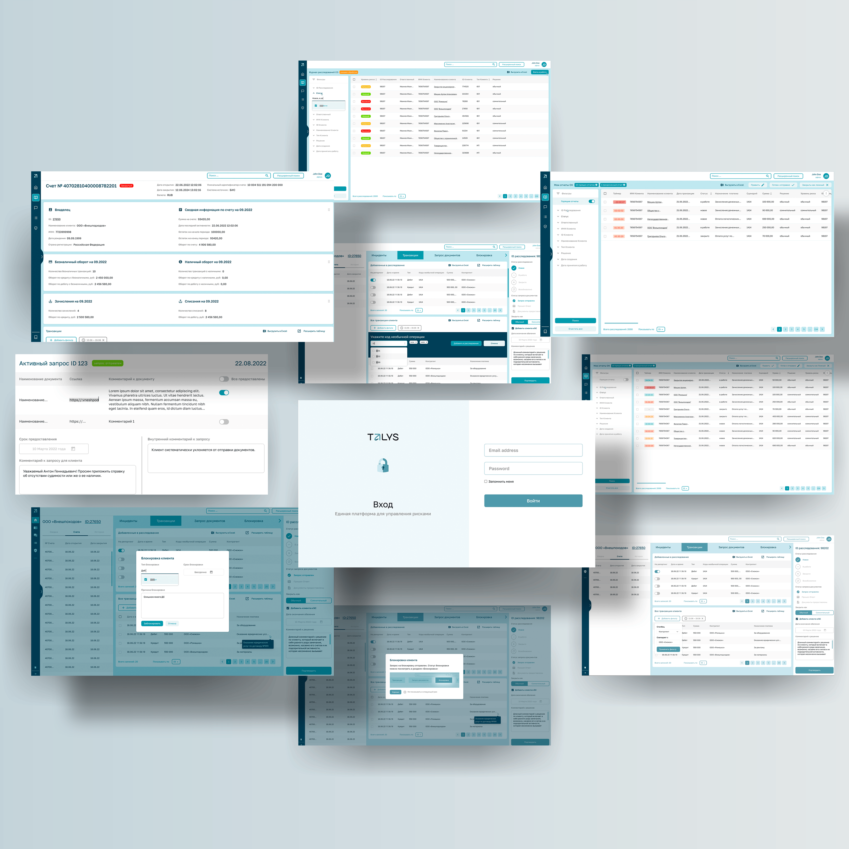
The modular system for monitoring fraud activity in financial accounting and credit organizations
The largest BI and Big Data solutions implementation company in Russia.
The main task of the project was to develop a modular system for monitoring activity in banks, designed for the bank security department (SAP analog).
We faced the task of creating a unique product for the Russian market, taking into account its legislative peculiarities and procedures for interbank and intrabank interaction.
The product consisted of a core part and modules sold separately for each bank. Therefore, each interface had to be flexible: allowing for expansion and re-use in a different context, as well as providing the system user with simple and memorable templates.
In total, about 40 pages with different modules and states were developed and assembled for each bank into a complete product.
The tables formed a major part of the interface, and it was necessary to make working with them as convenient as possible for a particular manager according to his job description. With the help of UX to highlight all the important points in the work process and minimize mistakes that can be made by inexperienced employees. And also the interface should minimize the onboarding time of new employees.
At the same time, one of the important requirements was not to deviate too much from the old system, so that banks would not waste time retraining employees and rebuilding processes.
The following are some of the points and discoveries we made in the course of our work.
In general terms, the process consisted of steps:
While working, the sales team presenting our prototypes brought new requirements and some of the steps were repeated for the most complex screens.
The project team lived the life of the bank's SB department and sorted out all the processes and instructions to create the final version.
Below are illustrated several design solutions useful not only for creating software for the SB department, but also for global tasks related to CRM system design.
The bank runs AI algorithms that scan transactions. For suspicious transactions, they create "incidents", which in turn can trigger an investigation process and pass the data to a bank employee for analysis.
When an employee selects the desired investigation from the list they are taken to the investigation screen.
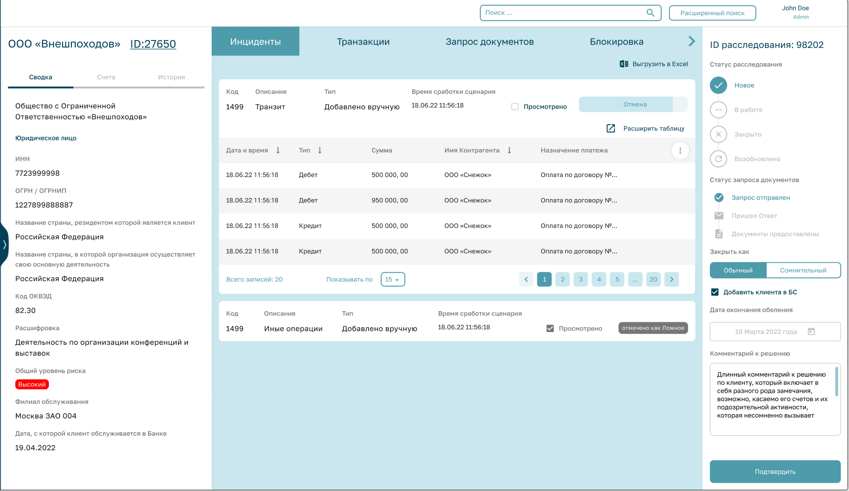
The screen is divided into three logical parts:
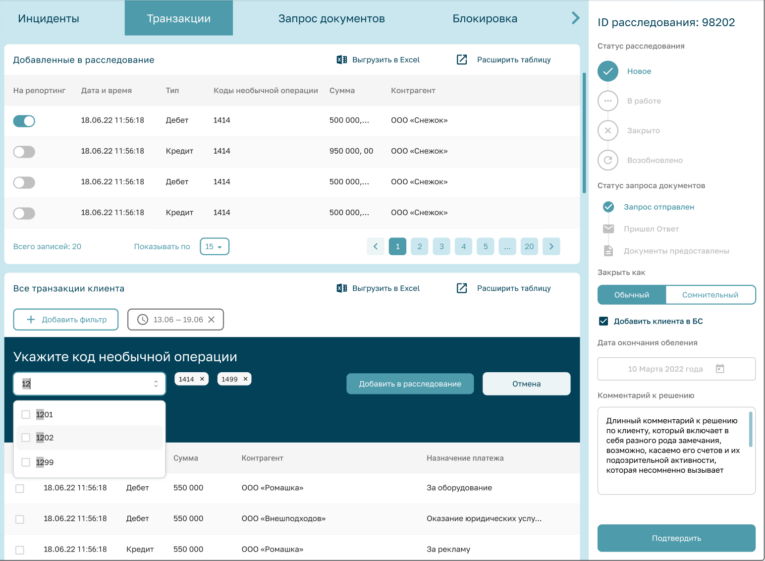
Sometimes not all transactions are included in the AI algorithm, so the employee needs to select additional transactions from the list to add to the report or to leave some transactions out of the report. Sometimes the customer card on the right side may not be enough and you want to know more. The user has an option to go to the client card.
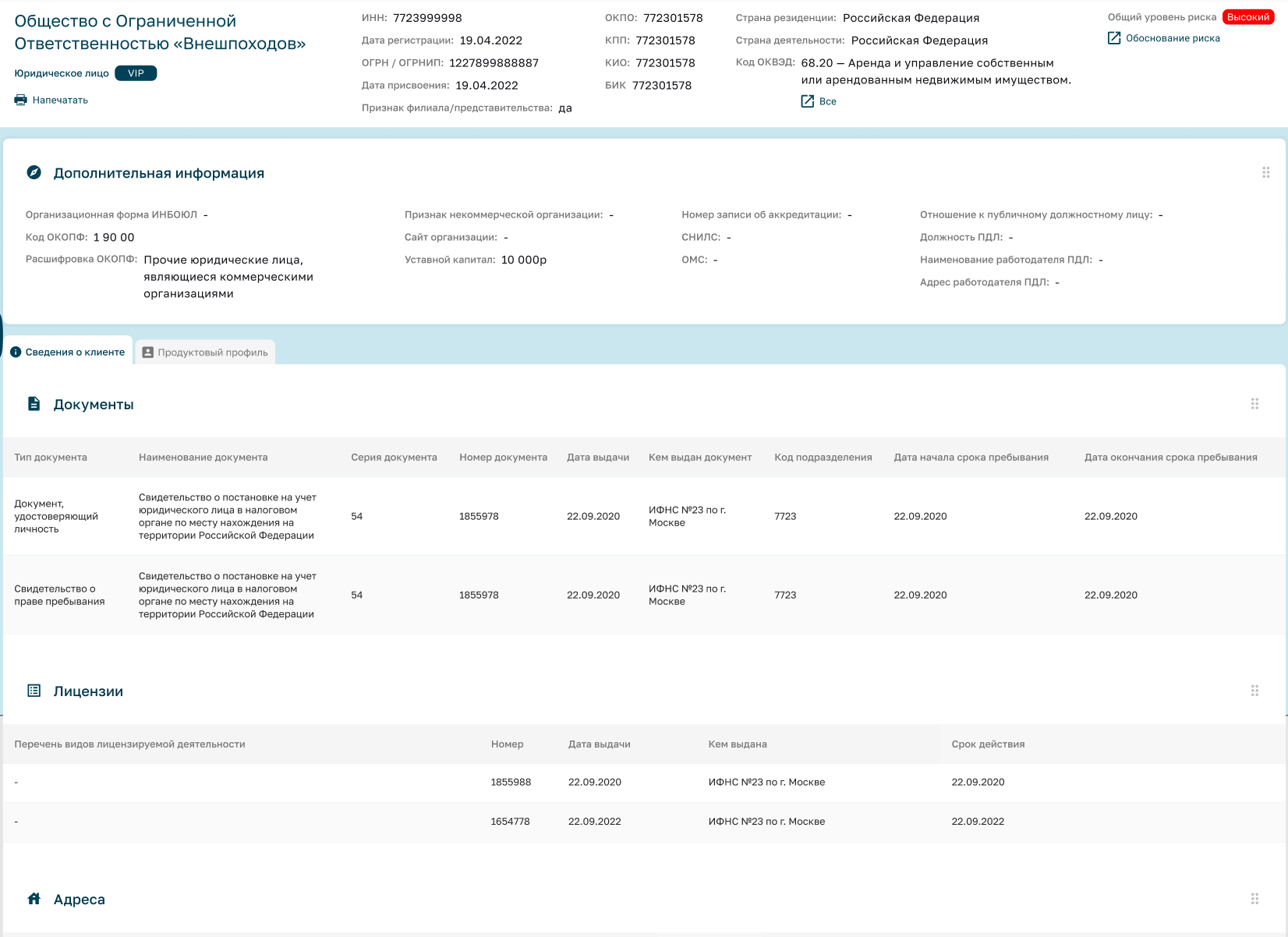
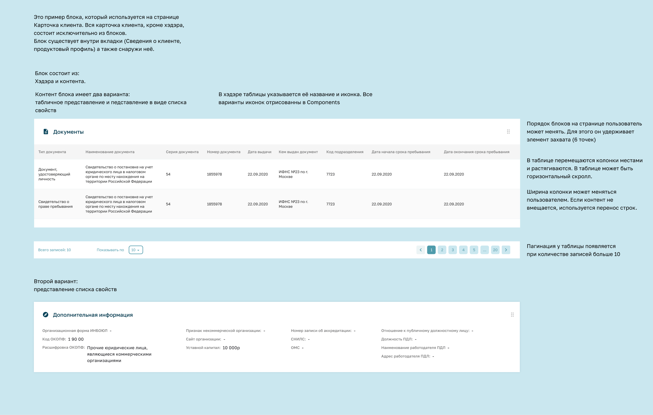
In concept, the card consists of the top block (main information). And other blocks: other information about the client divided into blocks. Blocks can be swapped, as well as moved from the tabs to the general level and back, so that the decision-maker can customize the display of information relevant to his/her tasks.
It's by no means always the job of a bank employee to be so calm in shades of turquoise. Sometimes you need to make quick decisions on incoming reports. A timed column and a filter for "burning reports" come to the rescue.
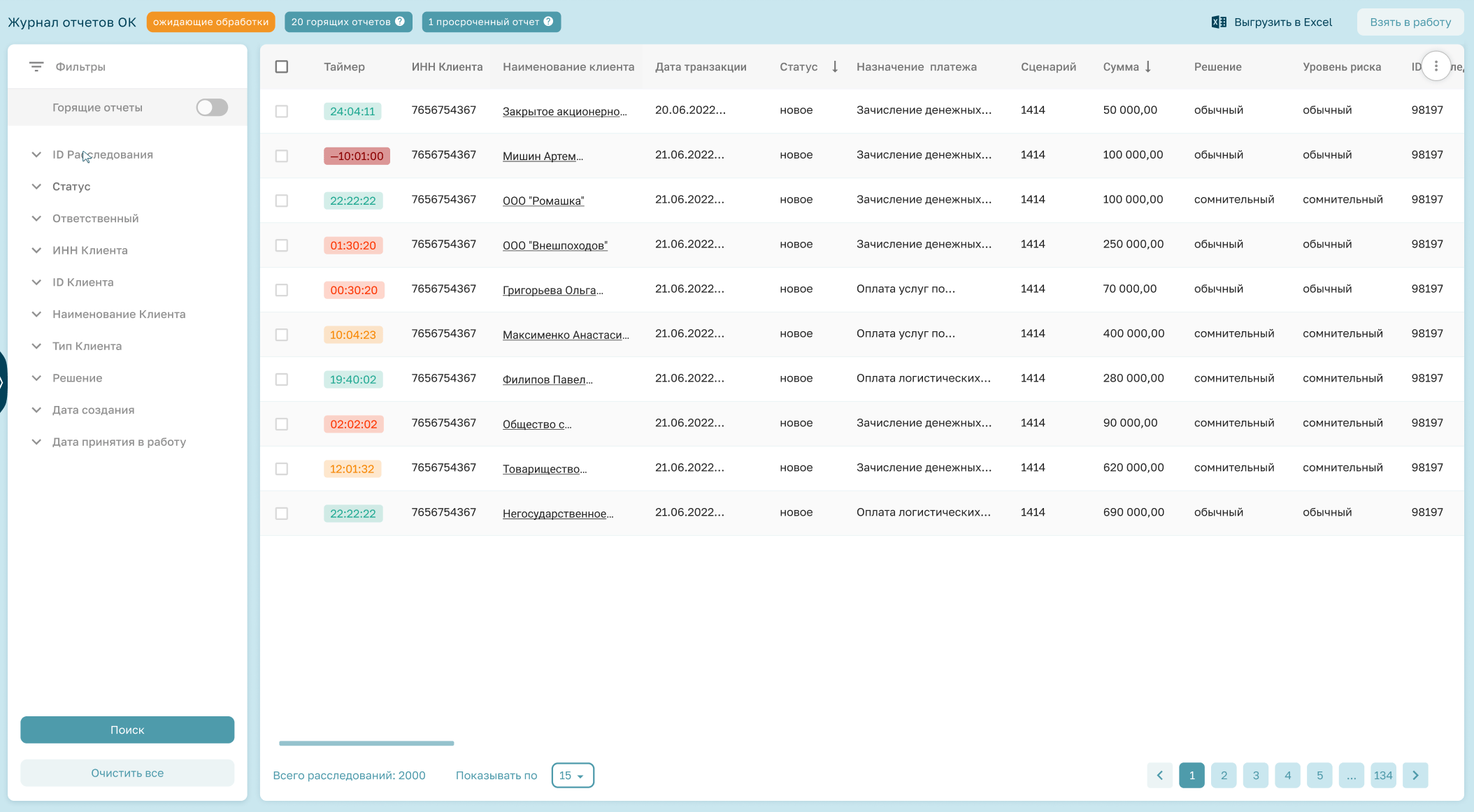
The result is an interactive UX-prototype fully ready for product presale. And also a figma file ready for the development department.
We wish that your transactions do not fall into the suspicious tab! And your life was as calm as the gamma of the application! See you on the next screens!
Interested in partnering with us? We love to hear from ambitious clients! Tell us what you’re looking to achieve and how we can contribute.
Get in touch