Easy-to-use, no-code bioinformatics software for NGS data analysis
Datirium. The company pioneered a streamlined approach to data analysis that empowers researchers to quickly gain insights from big data without becoming a data analyst.
We were faced with the task of redesigning the logic of the SaaS platform for bioinformaticians. It was necessary to make it as easy as possible to on-board new users in order to relieve the work of the support department.

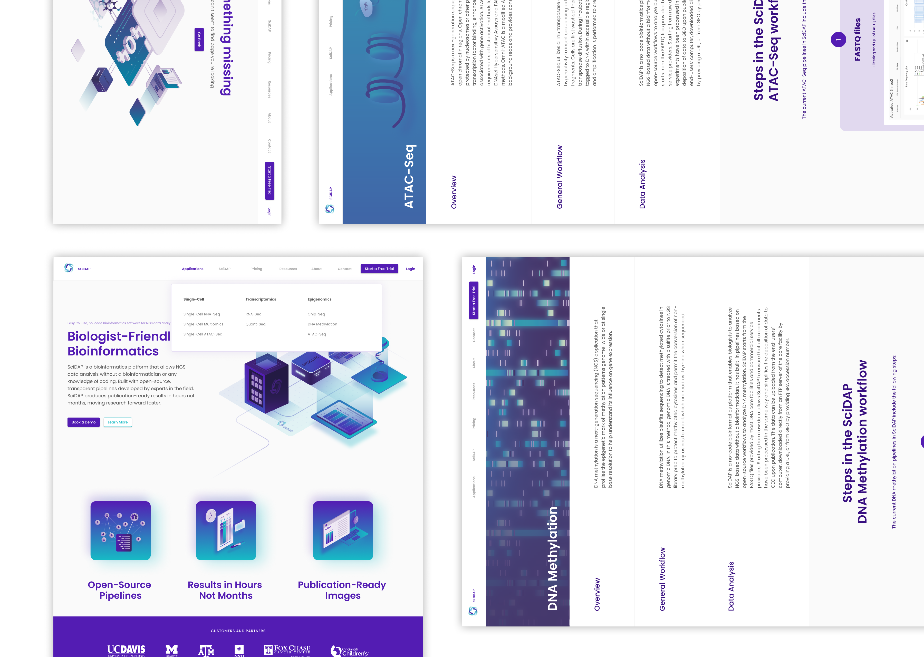
SciDAP is a bioinformatics platform that allows NGS data analysis without a bioinformatician or any knowledge of coding. Built with open-source, transparent pipelines developed by experts in the field, SciDAP produces publication-ready results in hours not months, moving research forward faster.
We saw the main vector of the solution in reducing the cognitive load on the user. For this purpose we developed a uniform design style for the components and adapted the UI kit material design to the project. Rather than complex html-forms and overloaded screens with components, we chose several simple UX-mechanics, which will be described in more detail below.
At the same time, we made several conceptually important decisions. We divided the main screen into two parts, with projects and samples on the left side and detailed instructions describing different types of biological experiments on the right side. We put the analysis statistics (the most important data for the user) on one of the main screens instead of hiding it in the experiment settings, as it was before the redesign. We rebuilt the application's vocabulary to reflect the lexical context of biologists rather than IT specialists.
By researching surveys, interviews and the previous version of the platform, we found that people get confused by CJM and leave before the product gives them value.
By maximizing the simplification of steps, for the first successful experiment and getting a non-ideal result, we found an end-to-end conceptual solution:
The interface is on the left and the interactive cribs to the right.
By passing this CX pattern through all the application screens, we got the necessary benchmarks. And further refined the application's UI.
As part of the design, we have simplified the user roles: from three to two.
And following a pattern:on the left is the interface, on the right is the online help, we rebuilt the project and experiment creation forms from a long HTML form into an interactive quiz that discards redundant choices as questions are answered.
After removing all the bottlenecks before creating the experiment, we focused on the CX of the most important screens.
We completely rethought the logic of the bio-experiment screens and focused on the benefit to bioinformaticians, namely the graphs and data generated from the experiment.
Moreover: we found out that a huge part of the user's attention is directed to the visualization of the graphs themselves. We developed an algorithmic color scheme that was used to determine colors and accents.
We also worked out the logic for end-to-end search through the app so that the experiments created would never get lost.
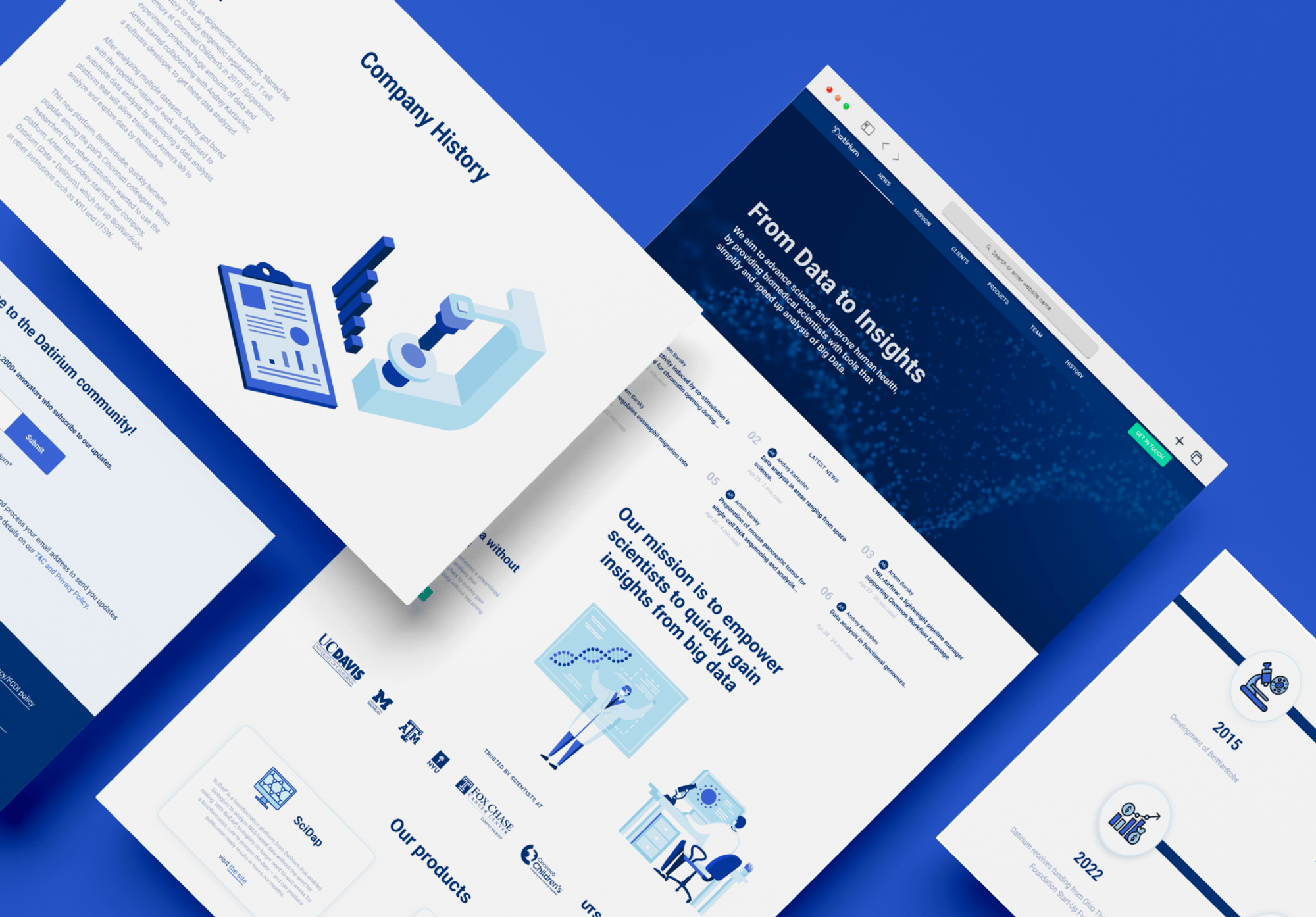
As a result, we developed two websites: datirium's corporate business card and SciDAP's bioinformatics platform site.
We redesigned the platform interface, which reduced the on-boarding of new users and allowed the product to grow its customer base without increasing the time to serve them.
Interested in partnering with us? We love to hear from ambitious clients! Tell us what you’re looking to achieve and how we can contribute.
Get in touch